Freelance Client
Creating the overall look and feel of an educational report, and corresponding Executive Summary document for S.A.L.V.E International.
The initial brief was to incorporate a more ‘fun’ layout following brand guidelines, to offset the seriousness of the report content.
Regular Social Media Posts and Stories are being created to highlight the work this Charity is doing to gather further support and funding.
Freelance Client
The brief was to update the existing print adverts to be more in keeping with the client’s website.
Working with Zoe, we created a more professional look and feel, reflecting her overall style and personality, bringing it more in line with her website and strengthening her brand.
Designed whilst an employee of Laban Brown Design.
Numerous documents were created for this client, including The London Journal. This was the official magazine published annually, each edition was given a theme by the current president in which to base the design, while still following brand guidelines.
Designed whilst an employee of Laban Brown Design.
An example of a new build checklist given to prospective homeowners, rolled out across all developments and a marketing leaflet for the latest release of homes on a build site. Each development had its own mini brand and all marketing material would follow this same style.
Acting as brand guardians for many years I was involved in numerous projects for this client, including corporate literature, signage, web design and both printed and digital marketing materials.
Over time I became responsible for creating new bid documents for the land sales department, producing at least two per month on a tight turnaround.
I was also charged with the design and build of marketing emails, creating at least five per week to be sent to Rightmove, Zoopla and company databases.
A current project, to redesign and build the clients existing website.
They wished to keep their logo, so we have introduced additional colours to the brand palette to give the website a cleaner, more modern look.
Designed whilst an employee of Laban Brown Design.
A subsidiary of the Trading Standards Institute, the UKECC required a family of pocket-sized booklets for a variety of consumer issues found when shopping abroad and in the UK. The final documents were available in both print and digital format, and updated bi-annually.
Designed whilst an employee of Laban Brown Design.
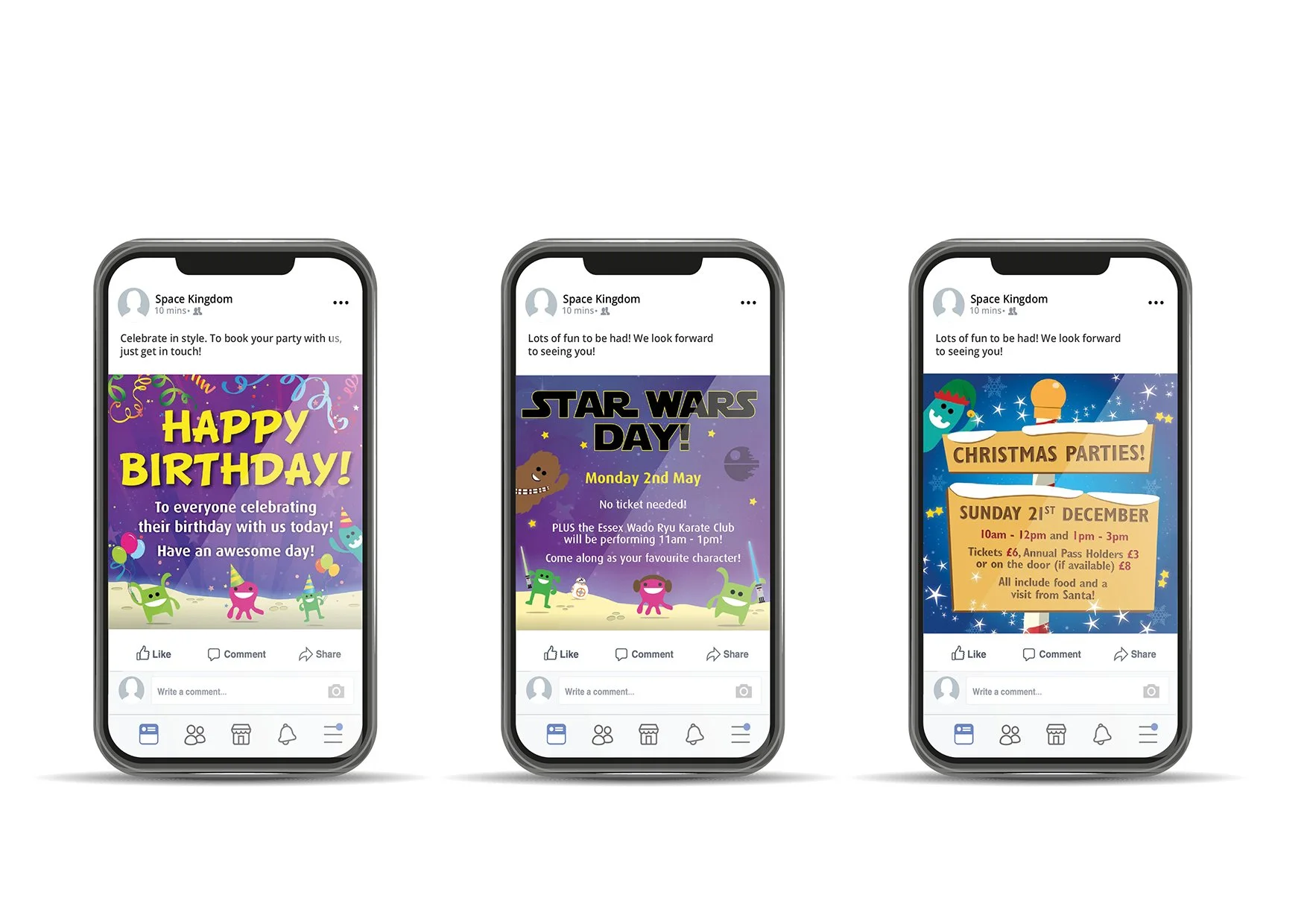
Creating an identity and brand style for a new children’s indoor play centre. A wide range of printed materials, signage, social media elements, and a website were produced.
The initial concept was created as a team, however once the centre was up and running I became responsible for new printed and digital material. For example, leaflets, invitations and posters, plus Facebook posts for upcoming events, with accompanying HTML emails.
Designed whilst an employee of Laban Brown Design.
Creating a new brand identity, which was applied across the company. Examples shown are the business stationery and marketing collateral that was developed and printed.
Designed whilst an employee of Laban Brown Design.
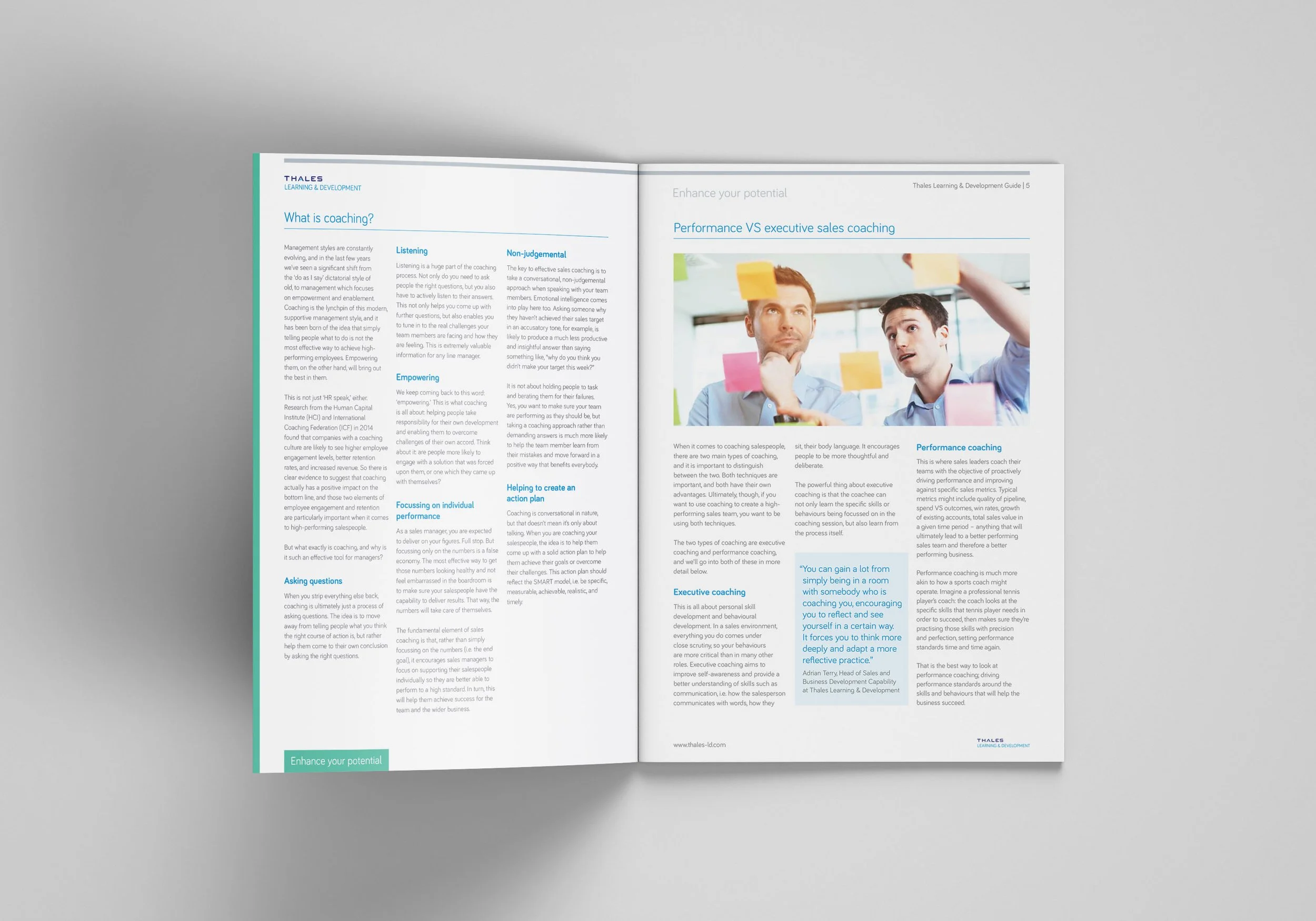
A long standing client, we as a company were responsible for helping Thales evolve their brand several times. I was involved in creating a wide range of items including; large scale signage, exhibition stands, vehicle wraps, printed/digital literature, Microsoft Word and PowerPoint templates, website design and social media banners.
Examples of the annual Course Guide I was responsible for setting out each year. The design would evolve slightly with each edition, but still keep the same overall look and feel.
One of the L&D Guides I was tasked with designing on a monthly basis, these were available as digital downloads and also sent out to department heads of prospective clients.
I was involved with a number of projects for Hidden Hearing, including advertising, digital newsletters and corporate documents. The example shown is for a Pre Course Training Pack, following their brand guidelines, which was then printed and set up as an interactive PDF.
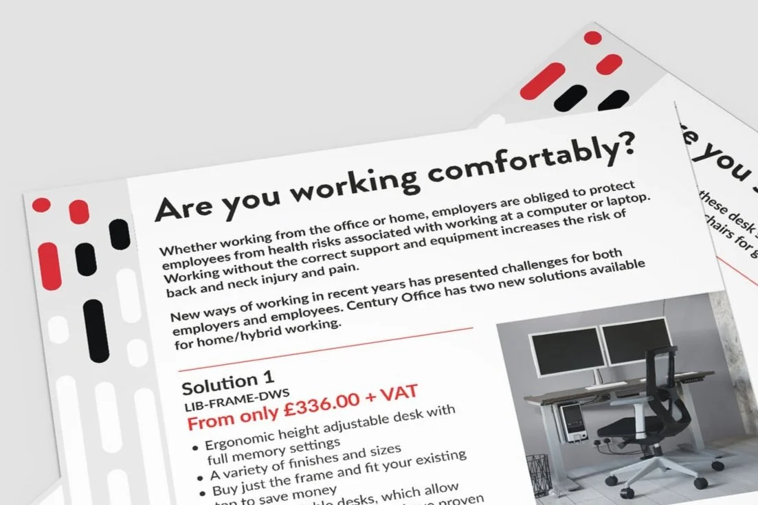
Due to changes in working habits after the pandemic, the client wished to create a double sided A5 flyer advertising their home office furniture solutions, targeting those now working from home and needing to upgrade their current work station.
Working closely with the client and following existing guidelines, these flyers were set in their new brand style, mailed out across the country and used at an exhibition.
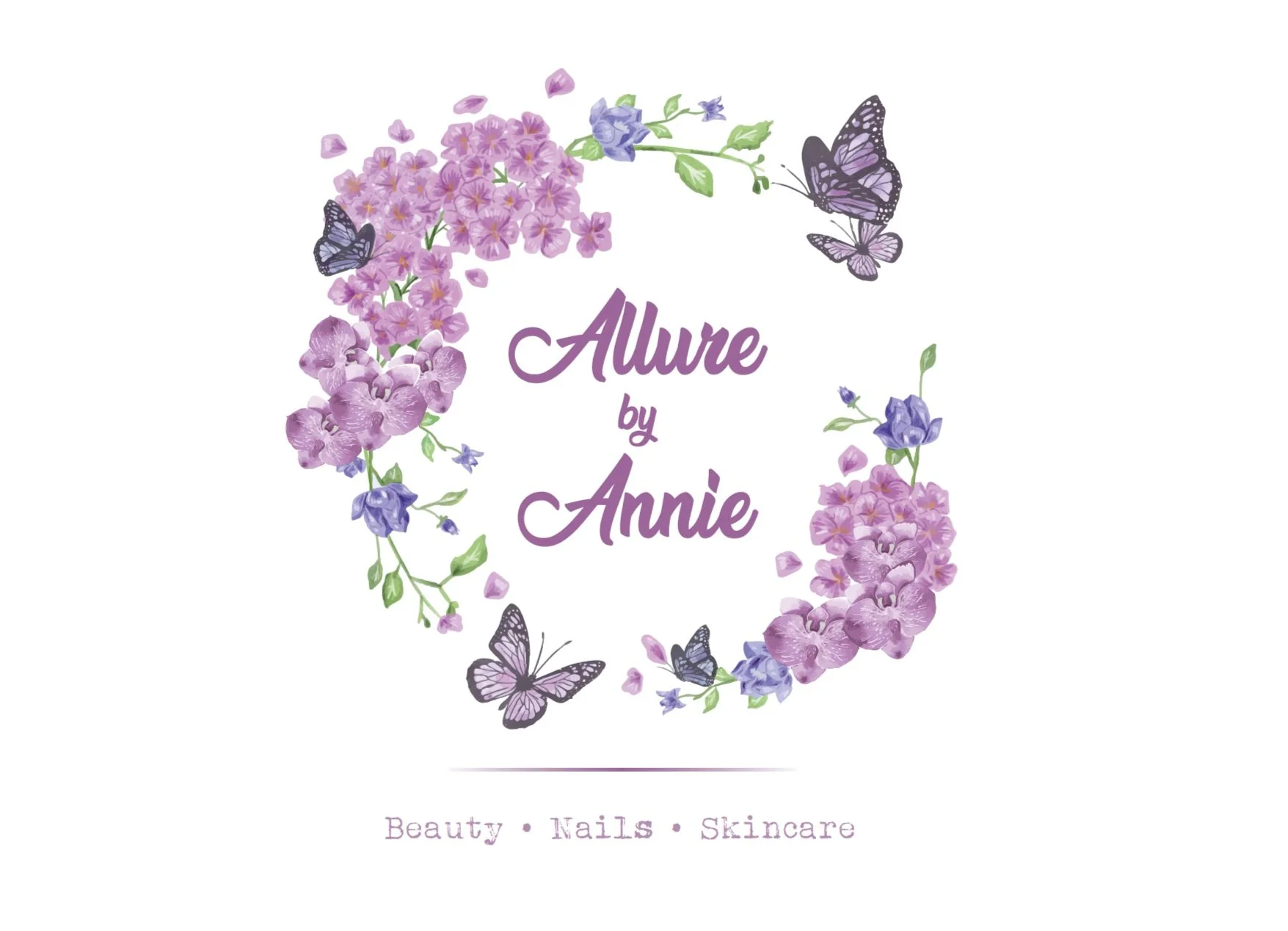
To create a logo and brand style for a new small beauty boutique. The client requested a floral theme, using hydrangea’s in particular, as they held sentimental value.
The new brand was applied to a series of printed materials including; treatment menu’s, leaflets, client record cards and treatment records. A new website was being created by a third party, I provided all the various elements and a simple brand guidelines document to ensure the look remains consistent.
Logo and brand style for a new business venture. This was rolled out across new printed stationery, as well as setting up a letterhead and invoice template in Word for additional documents. A website is currently in development.